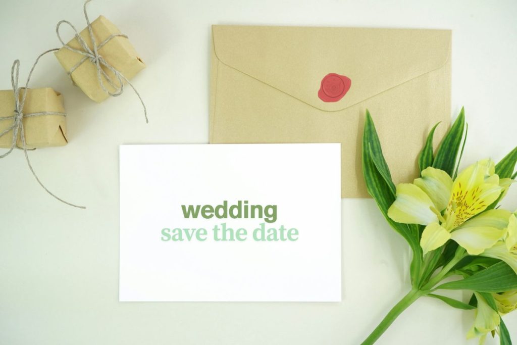
When couples design their wedding invitations, every detail counts. From the paper finish to the wording, each element tells a story. Fonts might seem like a small part of that, but they play a huge role in how an invitation feels. The right mix of fonts can bring elegance, romance, or even a hint of playfulness to your stationery.
Mixing fonts gives couples a way to express their personality while keeping things stylish and readable. Done thoughtfully, font pairings can guide the eye, highlight key details, and create a design that feels completely your own.
What You’ll Learn About Mixing Fonts
- Why font choice sets the tone of your invitation
- How to pair different font styles without clashing
- Mistakes to avoid when combining typefaces
- Tips to keep your layout clean and beautiful
Why Fonts Matter More Than You Think
Fonts do more than make text legible—they create emotion. A script font with flowing lines feels romantic and formal, while a clean sans-serif font might feel modern and fresh. By mixing two or three fonts thoughtfully, you can balance charm with clarity.
For example, using a calligraphy-style font for your names adds a touch of personality, while pairing it with a simple serif font keeps the rest of the invitation easy to read. The way these fonts play together becomes part of your visual theme—even before your guests open the envelope.
Start with the Feeling You Want
Before picking fonts, think about the mood of your wedding. Is it classic and timeless? Minimal and chic? Rustic with a handmade feel? This will guide your font choices.
Once you know your vibe, you can pick a primary font that matches it. This might be the font for your names or the heading. Then, you add a supporting font to provide contrast without stealing the show.
For example, a romantic script paired with a traditional serif works well for a formal wedding. For something more playful, you might pair a handwritten font with a modern sans-serif.
Pairing Fonts That Work Well Together
One key to a great font pairing is contrast. You want fonts that feel different, but not so different that they look out of place. Think of it like a conversation—each font has a voice, and they should complement, not compete.
Serif fonts (like Garamond or Baskerville) often work well with scripts because they bring a timeless, grounded feel. Sans-serif fonts (like Futura or Helvetica) can add a clean, modern look when paired with a softer script.
Try not to use more than three fonts on one invitation suite. Too many styles can make the design feel cluttered. Two fonts—one for emphasis and one for body text—are often enough.
Think About Readability
As beautiful as decorative fonts can be, they can also be tricky to read. Keep the flourishes and flair for headlines or names, and use simpler fonts for dates, times, and addresses. This ensures your guests don’t have to squint or guess at important details.
Font size and spacing matter, too. Avoid making your script font too small, or squeezing lines too close together. Give each line room to breathe so your design feels light and graceful.
Using Italics, Bold, and Capitals Sparingly
Even with just two fonts, you can create variation by using bold, italics, or all caps. For example, you might put the couple’s names in script, the date in uppercase serif, and the rest in a lighter serif font.
These tweaks add visual interest without needing extra fonts. Just remember not to overuse them. If everything is bold or italic, nothing stands out.
Less is often more when it comes to formatting.
Matching Fonts to the Rest of Your Wedding Style
If your wedding has a theme or color palette, your invitation fonts should reflect that. A black-tie wedding with gold accents might lean toward classic serifs and elegant scripts. A garden celebration might look lovely with whimsical, soft handwritten fonts.
Consistency matters. The fonts on your invitation should match or complement those on your menus, signage, and programs. This creates a cohesive look that ties your event together from start to finish.
Don’t Forget the Envelope
Your invitation suite includes more than just the invite itself. Envelopes, RSVP cards, and inserts are all part of the experience. Using the same fonts—or carefully chosen pairings—across all pieces creates a polished, professional feel.
You can use the main font for your return address or guest names, and repeat the accent font on RSVP cards or details inserts. These small touches make everything feel like part of the same story.
Testing Your Design Before Printing
Before sending your invitations to print, make sure to test your font layout. Print it at full size and review the spacing, alignment, and balance. Does anything look too tight or hard to read? Are the names standing out the way you want?
Sometimes what looks beautiful on screen doesn’t translate well to paper. A trial run can help catch any issues early.
It’s also worth asking a friend or family member to take a look. A fresh set of eyes might notice something you missed.
Work with a Designer If You’re Unsure
If pairing fonts feels overwhelming, you’re not alone. Many couples choose to work with a wedding invitation designer who can bring their vision to life. Designers understand typefaces and can create custom layouts that reflect your style while staying readable and balanced.
Even if you have a clear idea of the look you want, a designer can help polish the final version and suggest combinations you might not have considered.
Fonts are more than just letters—they’re part of your love story. Mixing fonts on your wedding invitations adds personality, texture, and beauty. Whether you’re going for formal, fun, or something in between, thoughtful font choices can make your invitation feel like it truly belongs to you.
