Choosing the perfect color scheme for your invitations can feel exciting, but it also comes with a little pressure. These cards are often the first glimpse your guests will get of your wedding day. They set the tone, hint at the style, and create the first emotional connection to the celebration. That’s why the colors you choose matter—not just to look beautiful, but to feel right.
Color has a way of creating mood. Whether soft and romantic, bold and modern, or natural and calming, the right palette brings your invitation to life. It reflects your personality, ties into your venue or season, and helps make the entire design feel intentional and complete.
What This Article Will Help You With
This guide offers thoughtful ways to choose a color scheme that feels personal and works beautifully across your wedding invitations. You’ll learn how to draw inspiration from your venue, season, and style, how to pair shades for harmony, and how to make sure your colors translate well from screen to print.
Start With Your Wedding Style
Before diving into colors, take a step back and think about the overall look and feel of your wedding. Are you planning a formal evening event or a relaxed garden party? Is your style more vintage or more minimal? These early decisions will help guide you toward the right shades.
For example, a formal ballroom celebration might pair well with classic colors like navy, gold, or black and white. A beachside wedding might call for sandy neutrals, seafoam green, or soft coral. Let the style speak first—your color choices will naturally follow.
Even if you haven’t finalized every detail, having a general sense of your wedding vibe gives your invitation design a strong place to start.
Let the Season Guide You
The time of year plays a big role in how colors are perceived. Spring weddings often feature pastels and light florals. Summer celebrations lean toward vibrant, joyful tones. Fall brings in rich, earthy hues, and winter often showcases deep, dramatic shades with metallic accents.
You don’t have to follow seasonal trends exactly. But using the season as inspiration helps your invitations feel grounded in time. It also means your guests will feel that connection even before the day arrives. A soft blue and white palette for a winter wedding can feel fresh and elegant, while rust and mauve in autumn feel warm and cozy.
Think about how the colors will complement the atmosphere you’re creating.
Use Your Venue as a Backdrop
Your venue often holds subtle color clues. Is there a wall, garden, or architectural detail that stands out? These elements can influence your invitation design in beautiful ways.
A historic estate might pair well with classic, muted colors and traditional fonts. A modern loft might call for clean lines and bold tones. If your venue is outdoors, you can draw directly from nature—greens, blues, and florals that match the surroundings.
Even if your invitations don’t match the venue exactly, using the space as a reference point helps everything feel more cohesive.
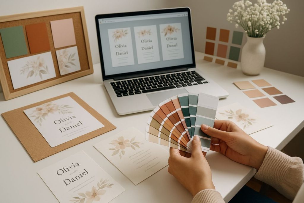
Pairing Colors That Work Together
One of the challenges in picking a color scheme is finding shades that complement each other without clashing. A good rule of thumb is to choose one main color, one secondary color, and one or two accents. This keeps the palette balanced and easy to work with.
Contrast is helpful too. Light and dark shades work together to keep the design from looking flat. If your main color is soft pink, adding a charcoal gray or warm brown gives depth. Accent colors like gold, sage, or blush can add richness without overwhelming the design.
Testing combinations on paper is key. What looks perfect on a screen might feel off in print. Ask your stationer or designer for samples so you can see the shades in person.
Thinking Beyond Trends
Trends can be fun to follow, but your invitation color scheme doesn’t have to match what’s popular right now. If something doesn’t feel like you, it won’t feel right on paper either.
Instead, think about colors that make you feel calm, joyful, or excited. Maybe there’s a shade that reminds you of a favorite place or a memory you share as a couple. Those personal connections turn a nice design into something unforgettable.
The beauty of invitations is that they are uniquely yours. You can pull in classic ideas or create something entirely fresh—whatever tells your story best.
Keeping It Readable and Print-Friendly
As much as color helps set the mood, it also needs to work with the text. Readability should always come first. If your background is too dark or bright, your names and details can get lost.
Stick with colors that offer enough contrast. Light text on a dark background can work beautifully, but it needs the right font weight and paper type. Dark text on a light background is often easiest to read and feels timeless.
Make sure your colors print well on the paper you choose. Some colors shift slightly when printed, especially if you’re using textured stock. That’s another reason to ask for print proofs before placing a final order.
Don’t Forget the Envelopes and Extras
Once you’ve chosen your invitation colors, think about how they’ll carry through to other details. Envelopes, RSVP cards, and liners all offer a chance to continue the theme. Using the same palette across these elements ties everything together.
You don’t need to match every item exactly. Just picking one or two consistent shades helps your invitation suite feel complete. For example, if your main invite is soft ivory with dusty rose accents, a matching blush envelope or a rose gold seal pulls everything together beautifully.
Consistency adds a quiet sense of polish that your guests will notice right away.
Let Your Style and Story Shine
Choosing a color scheme is one of the most enjoyable parts of the invitation process. It’s where design meets emotion, and where you get to shape how your wedding feels before it even begins.
By focusing on what matters to you—your story, your setting, your mood—you’ll find colors that feel just right. They don’t have to be flashy or trendy. They just need to reflect your day with care and meaning.
And when you open that first printed invite, with colors chosen from the heart, it will feel like the start of something beautiful.