The wedding invitation is more than just a card—it’s the first glimpse your guests will have of your big day. It sets the tone and hints at what’s to come. Whether you’re dreaming of a romantic garden affair or a modern city celebration, making sure your invitation matches your wedding theme can tie everything together seamlessly. And let’s be honest, there’s something magical about receiving an invitation that feels like a true preview of the celebration ahead.
Coordinating your invitation design with the wedding’s style doesn’t mean every detail has to match perfectly. Instead, it’s about creating a consistent look and feel that gives your guests a hint of the celebration’s mood. From the choice of paper to the font, colors, and illustrations, every part of your invitation can reflect your personal story and your wedding’s aesthetic.
What This Article Covers
Matching your invitations with your wedding theme helps create a consistent and memorable guest experience. Here’s a quick look at what you’ll find below:
- Why themed invitations matter for setting expectations and building excitement.
- How to match invitations with popular wedding themes like rustic, vintage, boho, classic, and modern.
- Tips for selecting colors, materials, and design details that complement your vision.
- Creative ideas to personalize your invites while staying on-theme.
Let’s take a closer look at how your invitations can reflect your big day perfectly.
Why Invitations Matter So Much
Invitations are often the first tangible detail your guests will see. They don’t just tell people where and when your wedding is happening—they also share a little piece of your personality and the atmosphere of the event.
Think of them like a movie trailer. The fonts, colors, wording, and even the envelope all work together to communicate something deeper than logistics. A soft blush invitation with watercolor flowers hints at romance. A gold-foiled design with black ink suggests elegance and formality. By paying attention to your theme and translating it into your invitation suite, you give guests a better idea of what to expect—and get them even more excited to attend.
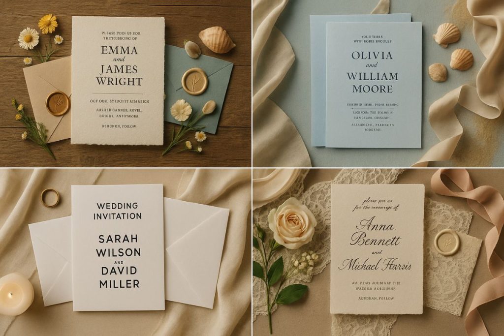
Matching by Theme
Rustic Charm
If your wedding is set in a barn, vineyard, or the countryside, rustic invitations are a natural fit. Think kraft paper, twine, muted earthy tones, and handwritten-style fonts. A simple botanical illustration or woodgrain background can help reinforce that natural feel.
You can also add touches like recycled paper or pressed flowers for a personal feel. Rustic doesn’t mean plain—just warm, organic, and full of character.
Vintage Elegance
Love the glamour of the past? Vintage-themed weddings often borrow from the 1920s to 1950s. Your invitations can echo this with art deco patterns, lace textures, and cursive script fonts.
Think ivory and gold color palettes, envelope liners with damask prints, or even cameo illustrations. A wax seal or old-style postage stamp can complete the nostalgic vibe.
Boho Beauty
Bohemian weddings are all about freedom and nature with a touch of eclectic flair. Invitations for this theme often feature dreamy florals, feathers, and watercolor textures.
Neutral tones with accents of terracotta, dusty rose, or sage green help keep things soft. The fonts are usually relaxed—maybe a hand-drawn script paired with a clean serif for balance. You might also include raw-edge paper for that artistic, natural look.
Classic and Timeless
If you’re going for a traditional church ceremony followed by a formal reception, classic invitations are a good match. White or ivory paper with black or gold text, engraved or letterpress printing, and formal wording never go out of style.
These invitations are simple but elegant, with no need for bells and whistles. A monogram or traditional motif can serve as a stylish focal point.
Modern Minimal
City weddings or contemporary couples often opt for sleek, minimal invitations. Think clean lines, sans serif fonts, and a lot of white space. Bold color blocks or geometric accents add interest without crowding the design.
Modern themes might also use non-traditional shapes, like square invites or vertical orientation. Acrylic invitations or vellum overlays are also popular options for that sleek, unexpected touch.
Color Coordination
Color plays a huge role in making your invitations blend naturally with your theme. Start by pulling your wedding color palette into the invitation design. If your palette includes navy and blush, try using blush envelopes or navy print accents.
It’s okay if you don’t match everything exactly. You can use different shades or complementary tones to keep things fresh but cohesive. Just avoid mixing in colors that aren’t part of your overall theme unless they serve a clear design purpose.
Material Choices
The feel of the paper you choose can also say a lot. Heavier cardstock feels formal and traditional, while handmade or recycled paper leans more rustic or bohemian. Glossy paper gives off a more modern feel, especially when paired with bold text or bright colors.
Textures like linen, cotton, or deckle edges can add interest and hint at the event style without being too obvious. Don’t forget the envelope—it’s the first thing guests touch and see. A colored liner or patterned back flap can make a big impression.
Fonts and Layout
Fonts are the personality of your invitation. A classic serif font might feel elegant and timeless. A handwritten script feels intimate and romantic. For modern weddings, sans serif fonts in all caps feel bold and clean.
Layout matters too. A formal wedding might use centered alignment, while a modern event might go off-center or asymmetrical. The spacing, how you break up the lines, and how much breathing room you allow all play a role in the impression you make.
Details That Make It Yours
Once the basics are in place, think about how you can personalize the invitation while still sticking to your theme. Maybe it’s a custom illustration of your venue, or a map drawn by hand. Maybe it’s including a meaningful quote that speaks to your relationship.
Wax seals, vellum wraps, or belly bands can add texture. So can ribbon, lace, or even a bit of foil stamping. Don’t feel like you have to include everything—just choose one or two details that make the design feel like your own.
Keeping the Whole Suite Consistent
Your invitation is just one part of a full suite, which might include RSVP cards, a details insert, menu cards, and thank-you notes. Keeping a consistent design across all these items helps reinforce your theme.
You don’t have to repeat the exact same design on everything. Just keep the color scheme, fonts, and general layout aligned. If your invitation has a floral border, maybe your menu card uses a single flower in the corner. It all ties together without being repetitive.
When in Doubt, Talk to Your Designer
If you’re working with a designer or stationery studio, don’t hesitate to share your mood board or wedding Pinterest pins. These references help them understand the tone and feel you’re aiming for.
Let them know which elements matter most to you. Whether it’s a certain flower, a family crest, or just a general feeling, a good designer will help translate that into paper and ink.
You can also ask to see samples or mockups before final printing. This gives you a chance to make sure everything feels right before it’s sent out.
Make Your First Impression Count
Your wedding day begins long before the ceremony. It starts the moment someone opens your invitation. Matching your invitations with your wedding theme brings everything together in a way that feels thoughtful, cohesive, and uniquely yours.
A beautiful invitation is more than just an announcement—it’s a promise of what’s to come. And with the right design choices, it can help tell your love story from the very first glance.